.Play
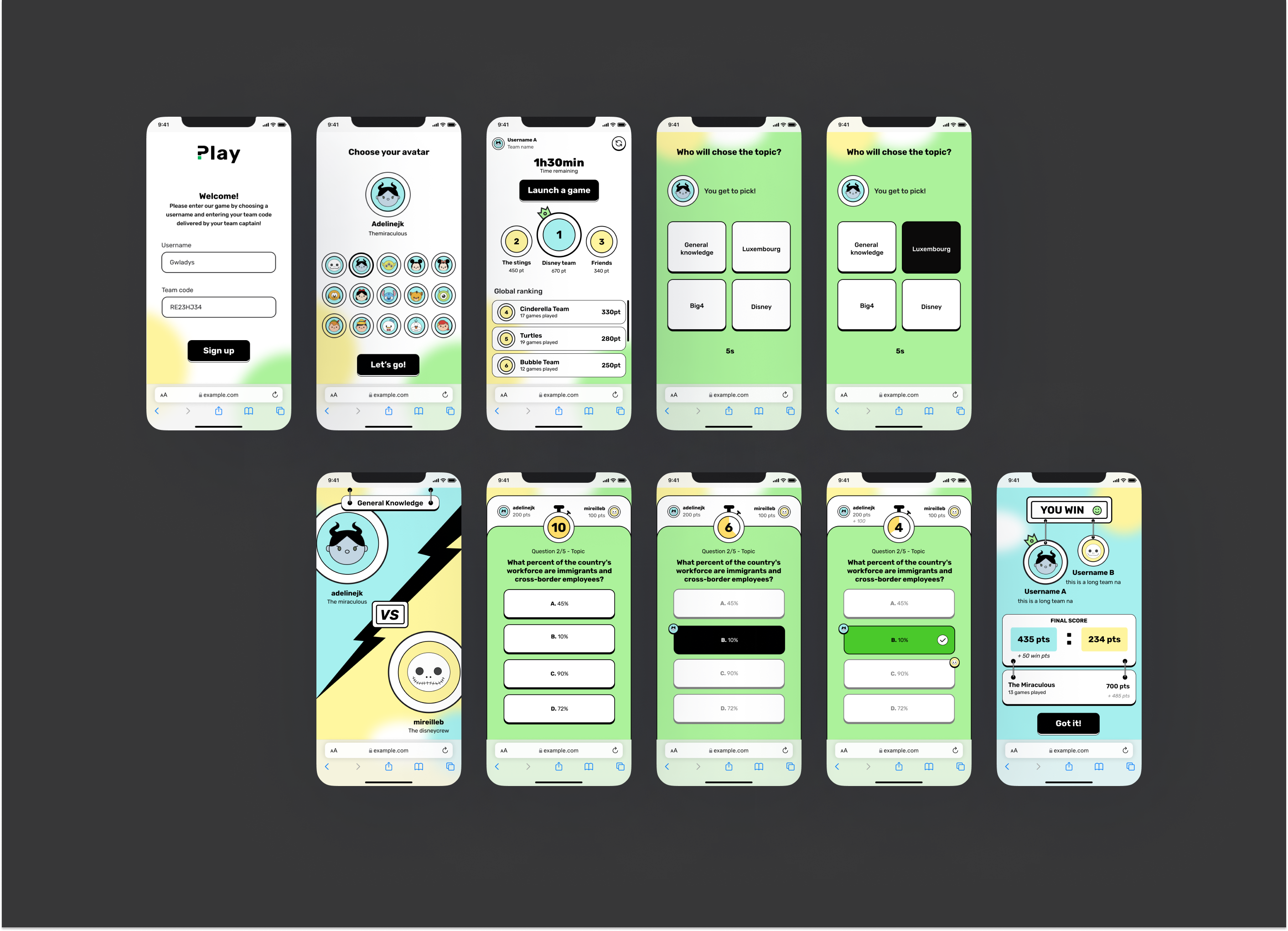
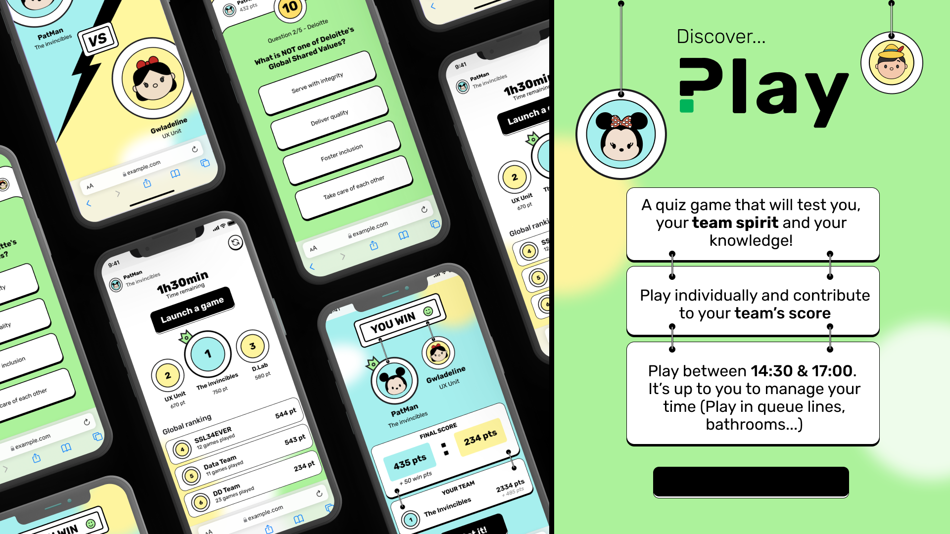
We designed a simple, intuitive and fun quiz webapp to improve and support team spirit for a big4. Forget about the boring experience!
This Quiz Webapp would be part of a team building experience for a Big4 company, where players will be in teams or in solo mode (in case of connexion lost or no opponent found).
Client
Big4Designer
Adeline JendrejakDiscover
I conducted a competitive analysis a to figure out behaviors and interfaces when it comes to a webapp quiz. * Kahoot, outgrow and Quipo quiz are popular webapp quizzes. * I compared available features to determine what is the most useful to us. I also gathered as much information I could by setting up meetings with my managers and extracted key features to create this webapp. Solo player mode Team player mode Versatility: we want to be able to play in a specific environment, an amusement park.Define
I curated two different personas with my user-centered approach to get a better idea of how my user would react to this quiz app. Laura, the latest new joiner, is also a travel blogger who likes to share her most recent adventures. She recently joined the Big4 and she is ready for new experience, feels very excited but can also feel overwhelmed. Tom, the senior manager, who likes his old habits and love everything corporate. He does not like change and feels lost when it comes to stepping out of his comfort zone. How can we improve the player experience? To conclude my research, I came up with a few How Might We statements to focus on the users' pain points and how to incorporate both a modern and corporate feel throughout the web application. How might we create a fun experience and keep also a coporate feel? How might we make sure the user gets the most seemless game experience? How might we tackle lost connexion or error management whithout frustrating the player?Develop and deliver
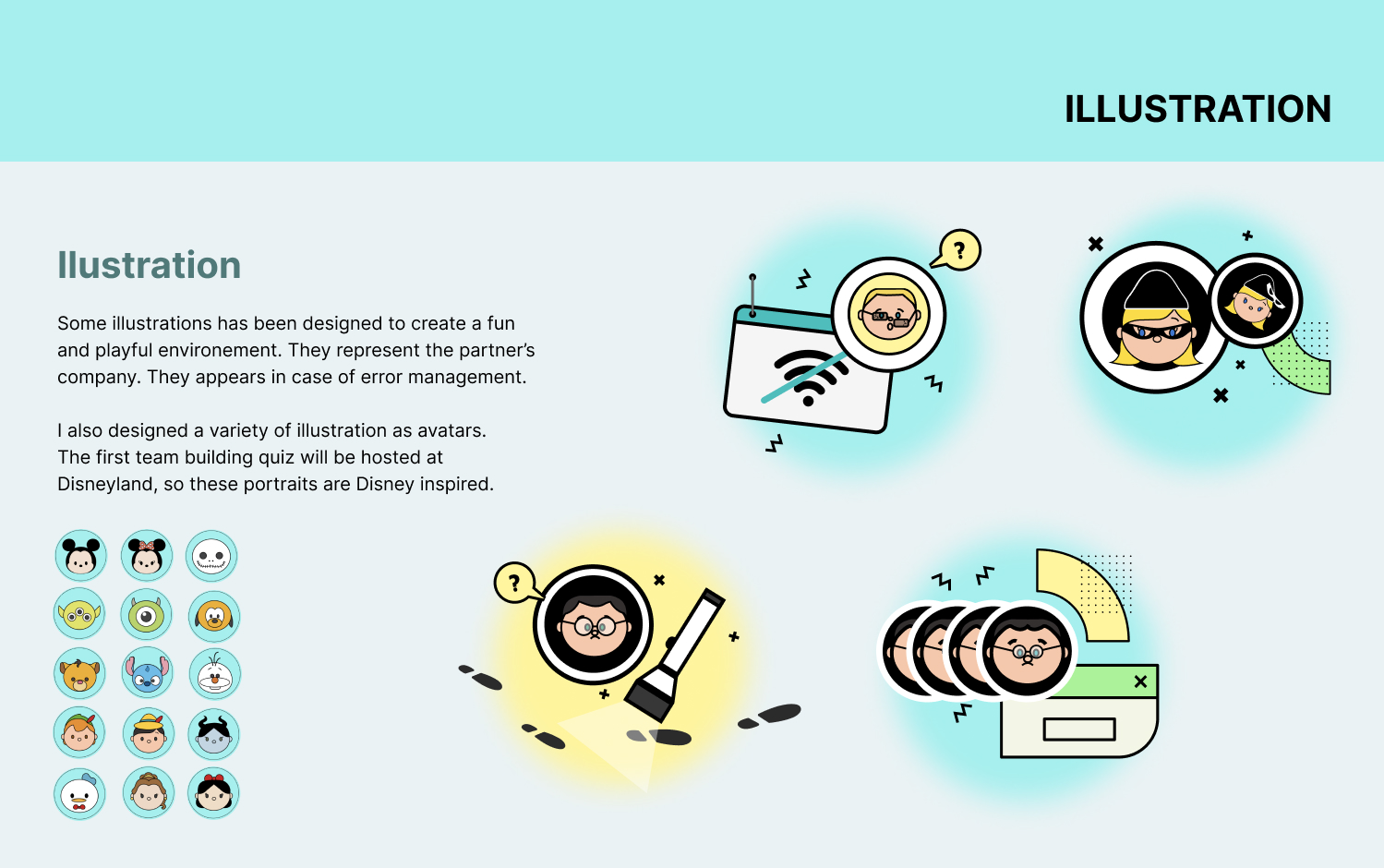
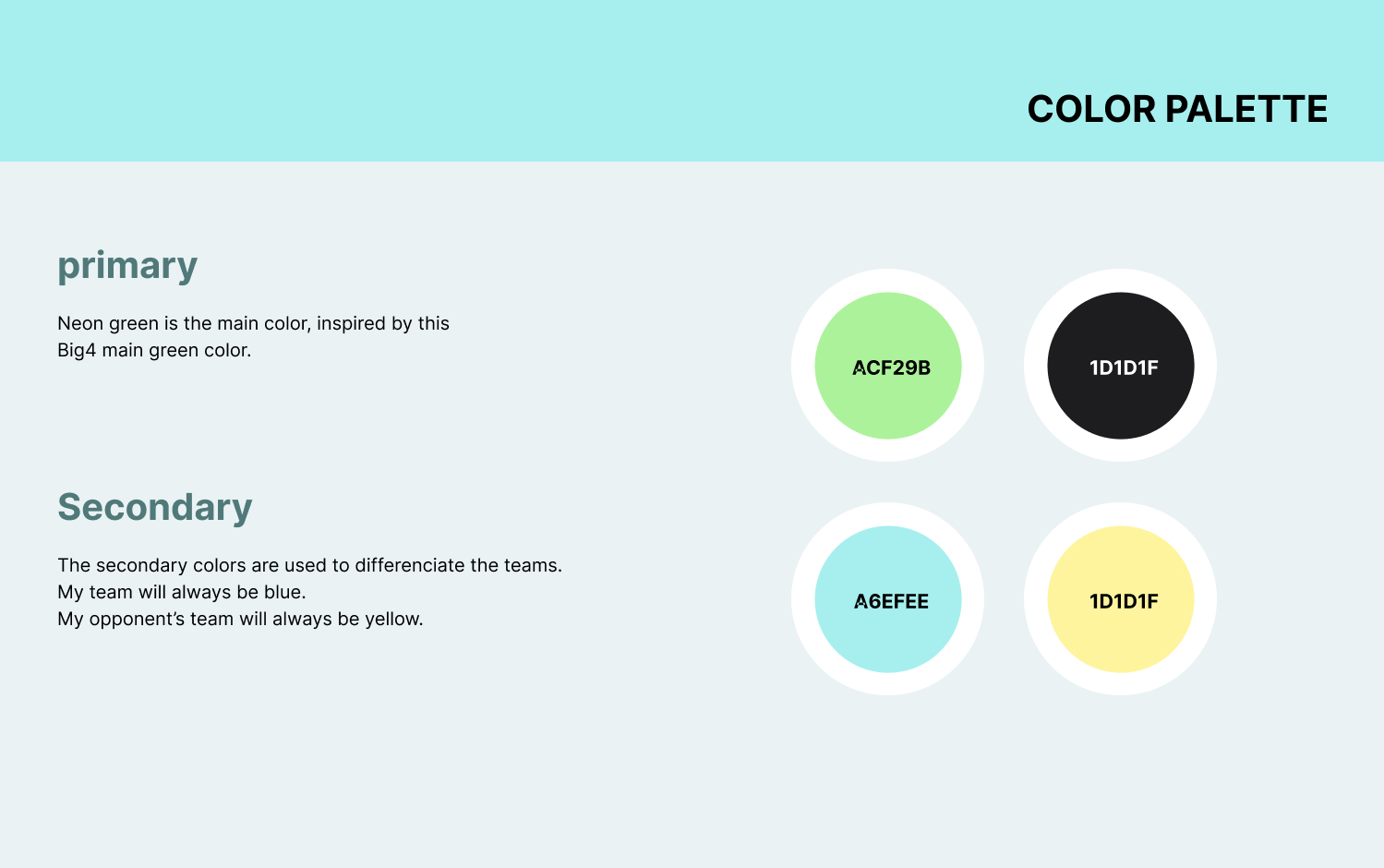
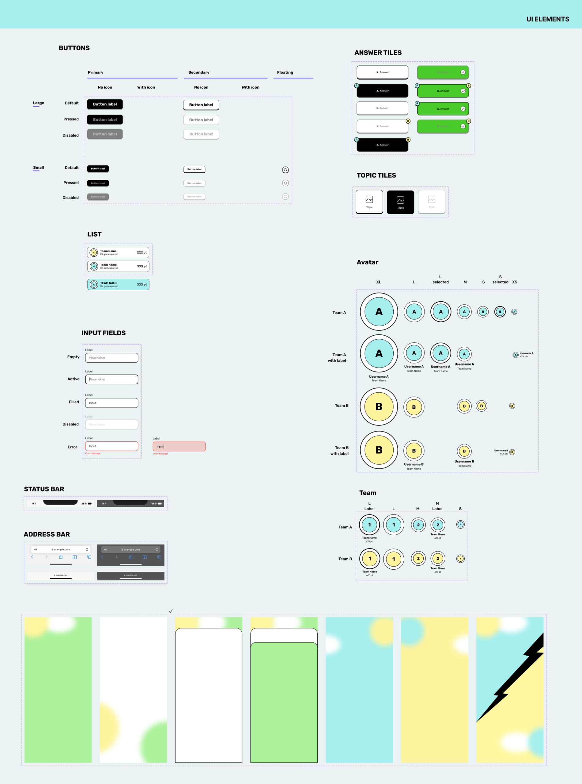
It was finally time to think of the task flow and user flow. I mapped TO BE the process and validated the process .The challenge was to make the UI feel modern and corporate. I created a very simple logo inspired by the DOT, which is a graphical element used very often within the company. The graphic style is derived from the Neomemphis style, that we used in touches to bring happiness and playfullness within the app. The goal was to have clear and simple screen with a small touch of Neomemphis design.Date
21 juin 2021
